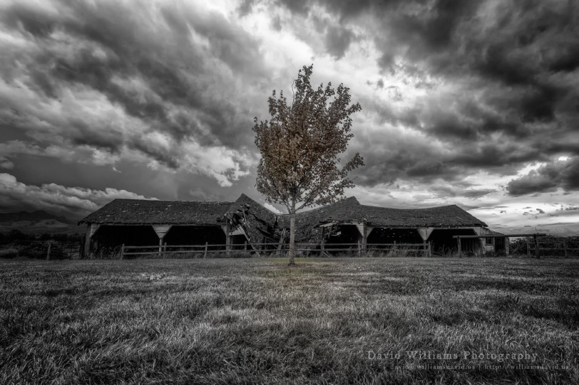
f/11 | 1/60 | iso 100 | Canon 17-40mm f/4L USM @ 17mm
Took a little stroll at Northern State Hospital last week, thought this was a cool sight! As I was finishing the colour version, Amy passed by and thought it would look cool in B&W with some selective colouring…oddly enough I think I like the colour version over the B&W. What are your thoughts?

f/11 | 1/60 | iso 100 | Canon 17-40mm f/4L USM @ 17mm
…Enjoy!
![]()
© Copyright 2013 David Williams

This work by David Williams is licensed under a Creative Commons Attribution-NonCommercial-NoDerivs License.

WOW! They both so impressive. Great shot. Thank you, love, nia
Thank you for the comment Nia, really glad you like them!
Wow! Love the B&W! Can’t we ever be together on anything? Thanks for the corn.
Dad…you mean you actually like the B&W version over the colour? Are you feeling okay? 😛 Figures that perhaps one of the only times I like a colour version over a B&W you like the B&W! Amy thinks it’s because you guys are on the same wave length. 😉
Both are excellent, David. The black and white version has that eerie feeling, especially with that much drama in the sky. I am honestly torn, I like the feeling that the BW evokes, but I also like the colored version because I see more of the actual scenery.
I know what you mean Gracie about the B&W but prefer the colour version. 😀
As always, I am blown away by your photography…but I was actually speechless as soon as I saw the B/W…so Amy scores a point 😉 Terrific! As always!
Thanks Elizabeth, your compliment is totally appreciated! 😀
I am a bit put off by the colour in the grass in the first one – if it was just in the leaves I might prefer that version. Either way a nice shot – I like the composition. And the sky.
Totally know what you mean, I was going back and forth with the grass bit but since my love dug it…well, or course I went with it!! 😀 As always, thanks for the comment, always love your input.
In this case, I prefer the color version!
Anyway,both photos are fantastic……
Thanks for the comment, both are pretty cool and I agree, I like the colour version. Thanks for stopping by, always appreciated!
I have a penchant for B/W but I think color works better on this subject. Just my impression, though 🙂
Thank you for the comment, I like the colour version myself (sorry Amy…love ya)! 😀