
f/4 | 1/4 | iso 100 | Canon 100mm f/2.8L IS USM Macro
f/4 | 1/4 | iso 100 | Canon 100mm f/2.8L IS USM Macro
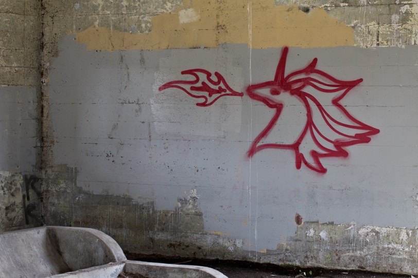
Went to Northern State to see what I can find as far as graffiti goes…sigh. So either the graffiti artists decided to take this quarter off or, they already cleaned up the place! Only found a few pieces left. About the title, it totally reminded me of a Pokemon character called Rapidash (and my girls agree…yay, dad was paying attention)!
I decided to play around with a black and white version of this image, while the colour is good it just screamed to me to be converted, have some noise added…have a little film noir going. What are your thoughts, black and white or colour?
…Enjoy!

© Copyright 2012 David Williams

This work by David Williams is licensed under a Creative Commons Attribution-NonCommercial-NoDerivs License.

It’s a deer or springbok (David, where do springboks roam the open veld?). There is a second horn you can see the tip of it to the right. Check out pictures of the springbok and you will see I am right. I still prefer color. B&W is so passe’ if you are old enough to have lived during the nothing but B&W era.
Hahaha, thank you for the comment dad, made me smile! Where do springboks roam, I am going to guess somewhere in Africa…not sure where…but somewhere! 😀
I guess I’ll go with the crowd. The B&W seems darker (duh) and more serious. It’s even a little, well, scary-looking. The color…not scary at all, more playful.
Scary eh…funny how going a different processing route can change the feel of an image so much! As always, thank you for the comment!
B&W for sure. But my question is, what tagger is tagging up walls with a unicorn? What is his tagname?! Hahaha! Love it!
As Cait would say…”I know right…”! Sigh, only 12 and sounding older…how are we going to survive this!!
Well, at least the unicorn is breathing fire, that’s a plus. 😛 Great to see you around again Morgan, loving your images!
Hi, for me, black & white it is…
Hey there, glad to see you back around! Thanks for the comment, glad you like the image. 😀
definitely black and white
Thanks for the comment Helen, I think B&W wins on this one. 😀
Black and white for me. One thing I like about it is that the left side does not end in a corner – it seems to carry on into the darkness which is to my way of viewing an improvement. And generally fewer distractions for the eye – like that yellow paint.
Thank you for your very insightful comment! I think the cement trough (pretty sure that’s what it is) in the B&W is a little less distracting and even perhaps, a little more interesting!
I noticed that as well – I would agree with more interesting for the trough.