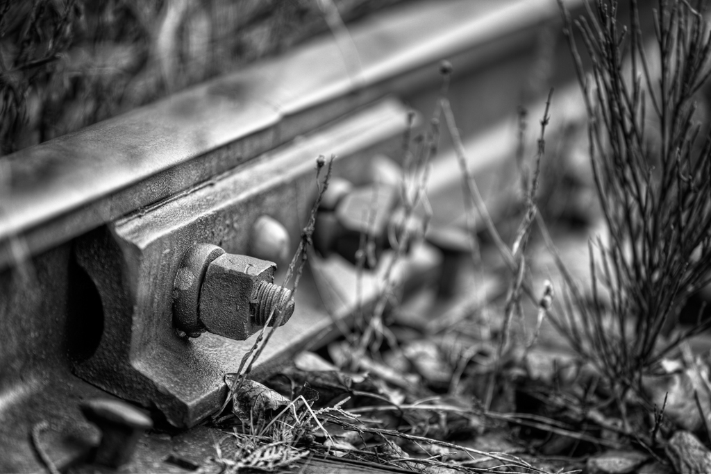
f/2.8 | 1/80 | iso 100 | 7 bracket HDR | ev +/- 1 | Canon 70-200mm f/2.8L IS USM II @ 200mm
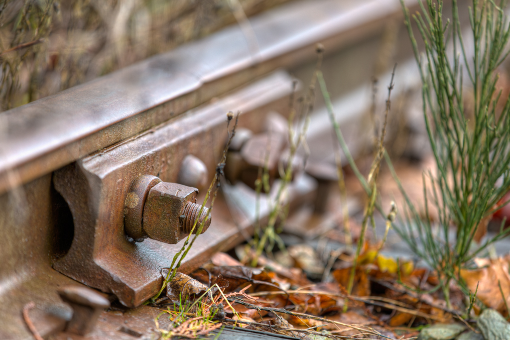
f/2.8 | 1/80 | iso 100 | 7 bracket HDR | ev +/- 1 | Canon 70-200mm f/2.8L IS USM II @ 200mm
So I was sitting there last night toggling between colour and B&W for this image and just couldn’t decide which to use. Amy preferred the colour, I preferred the B&W…which do you prefer?
…Enjoy!

© Copyright 2012 David Williams

This work by David Williams is licensed under a Creative Commons Attribution-NonCommercial-NoDerivs License.

For some reason the B&W seems sharper. I like it better, too.
I see what you mean, it does appear to be sharper! Thanx for the comment!
I agree with that observation as well. Like them both, but prefer the b&w.
Fabulous images! I particularly like the black and white version – it emphasizes the beautiful shallow depth of field and the great textures.
Thank you so much Martina, always appreciate your comments.
both photos are interesting in contrast and details, nice work and presentation
Hi Fabrizio, glad to see you around again! Thanx for the comment. 😀
I am always partial to B and W.
I seem to be lately! Thank you for the comment and of course, for visiting. 🙂
Es muy difícil, pero después de observarlas un rato creo que me quedaría con la de color, ¡me gustan mucho!, besos David
Thank you for the comment, chalk another like for the colour/color version! 😀
I prefer color (US spelling of colour). Black and white is sooooo! black and white. I was a teenager before my folks could afford color film. B&W may be nostalgic for some but it can be a sign of poverty to others.
Hi dad, thanxs for the comment, it’s really an interesting one. I never viewed b&w that way before, it’s a rather interesting view point! Personally, I love b&w images (as you can tell lately by my posts). 😀
Great shot! I REALLY like the B&W.
Thank you very much, seems like most folks are liking the b&w! 😀 Hope to see you around again.
I am torn, David. But I think I like the B&W more as well. I like how the monochromatic conversion enhanced the grimy texture of the bolt and nut. Excellent shot!
I noticed the same thing on the B&W in this image…and in many others I’ve processed, I am certain it’s how I process the conversion. Thanx for the comment Gracie. 🙂
Definitely the BW version.
Thanx for the comment (and for siding with me)! 🙂 hope you have enjoyed this post.
I can see why you had a hard time deciding. I like them both too. Maybe, the B&W a tad more. 🙂
While both have good qualities, I still stand by my decision! Thanx for the comment, always appreciated!