f/3.5 | 1/40 | iso 100 | Canon 100mm f/2.8L Macro IS USM
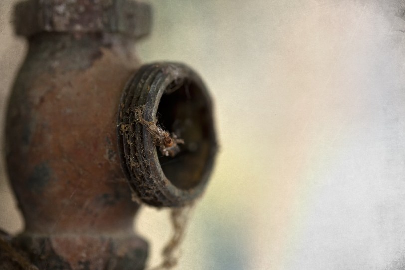
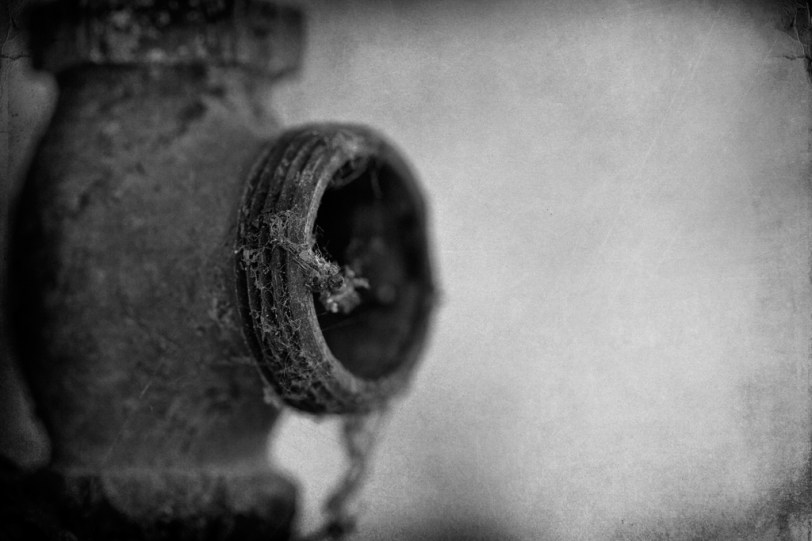
Another shot from Northern State Hospital, no idea what the pipe was used for, however, it looked pretty cool so how could I pass it up? Ever get ready to post something and think..hmm, wonder if I did this or perhaps that to this image? Yeaaaa, well…that’s what happened to me this morning. I was all ready to post the colour version and wondered what it would look like in B&W…what do you think? Personally, I like the B&W version. 😀

f/3.5 | 1/40 | iso 100 | Canon 100mm f/2.8L Macro IS USM
…Enjoy
 © Copyright 2012 David Williams.
 This work by David Williams is licensed under a Creative Commons Attribution-NonCommercial-NoDerivs License.
Love both, but I dig how the tone of the BW still gives a sense of the rust.
Isn’t it so well worth it to slow down and capture stuff like this. Fan of both, will will have to agree that I like the B&W better. I think the single toning simplifies it somewhat for the eye.
Pretty hard choice, but I would go for the colour. The cobwebs are a bit better in the black and white, but overall the colour one works better for me. Though quite why I can’t really say.
Seems to be the common thought, the colour. 😀 As always, thank you for the comment Ehpem, always always greatly appreciated!
It’s hard to choose — I really like both versions. Excellent composition 🙂
Thank you very much Mufidah.
The color seems to show the age more and I note the object itself, but the B&W shows more texture and I notice the cobwebs and dirt more; so, It simply alters the perspective for me. Both great! This looks like an old fire hose attachment (grandpa was a fireman back in the day, I’ve seen my share of photos, but alas, only a guess).
Hi Melanie, thank you for the comment! A fire hose attachment, interesting. The location of this little fella was mid wall, just a pipe going up and down the wall. It was located about 5 or 6 feet from what I believe to be a boiler or perhaps a furnace of some sorts (lots of pieces missing)…
My favorite is the color version but I like the texture a bit more in the b/w version. So both are good but the color is still my favorite…..
Thank you, I think the common thought is the colour…
I like the black and white
Thank you very much for your comment Jason, greatly appreciated! I would also like to thank you for visiting and hope to see you around again. 😀
Reblogged this on Conceptual Art.
I vote for the color version. The details of the pipe are lost in the b&w and the subtle green/blue areas at the top and bottom of the color version compliment the pipe’s color. I do like how the textured layer pops on the b&w, though.
I see what you mean Dan and am leaning towards the colour version myself. I really like the “dead space” in the colour version, the colours there are simply wonderful (if you ask me)!
Very nice captures. I prefer the color in what it speaks to me. B &w needs more contrast IMHO.
I’ve been looking at the two images for awhile now and tend to lean towards the colour version now. 😀
B+W or Color version, that´s a hard one David, they´re both nice 🙂
Thank you Adrian, they both do have good qualities. 😀